Appearance
Chart Tool
Overview
The Chart Tool creates interactive data visualisations from feature layer attributes. It supports ten chart types and provides a step-by-step configuration workflow for selecting data sources, fields, and aggregation methods. Charts are rendered using the ArcGIS Charts component with interactive features such as hover details, zooming, and legend controls.
Key Features
- Ten Chart Types: Bar, Line, Pie, Radar, Gauge, Heat Chart, Combo Bar-Line, Histogram, Scatter, and Box Plot
- Layer Auto-Conversion: Automatically converts Map Image Layers to Feature Layers for charting
- Multi-Field Support: Select multiple numeric fields and switch between them via tabs
- Category Value Filtering: Load unique values from a category field and filter chart data by selection
- Aggregation Options: Count, Sum, Average, Min, Max, and other aggregation methods
- Fullscreen Mode: Expand charts to a larger modal view for detailed examination
- Step-by-Step Configuration: Accordion-style setup with layer selection, chart type, and field configuration
How to Use the Chart Tool
Accessing the Tool

- Locate the Chart icon in the right panel toolbar
- Click to open the Chart Tool panel
- The configuration tab appears with a step-by-step accordion
Step 1: Select a Layer
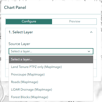
Choose a visible feature layer from the Source Layer dropdown. The list includes:
- Feature Layers: Direct charting support for all chart types
- Map Image Layers: Automatically converted to Feature Layers (some advanced chart types may be limited)
Step 2: Choose a Chart Type
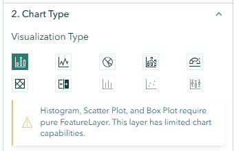
Click one of the ten chart type buttons to select your visualisation:
| Chart Type | Icon | Best For |
|---|---|---|
| Bar | Bar chart | Comparing categorical values |
| Line | Line graph | Showing trends and changes over categories |
| Pie | Pie chart | Displaying proportions of a whole |
| Radar | Radar plot | Comparing multiple variables simultaneously |
| Gauge | Gauge meter | Showing a single value against a target |
| Heat Chart | Heat grid | Cross-tabulation of two category fields |
| Combo | Bar + line | Combining bar and line in a single chart |
| Histogram | Distribution | Showing frequency distribution of numeric values |
| Scatter | Scatter plot | Showing relationships between two numeric fields |
| Box Plot | Box and whisker | Displaying statistical distribution summaries |
INFO
Histogram, Scatter, and Box Plot are only available for native Feature Layers, not for converted Map Image Layers.
Step 3: Configure Fields
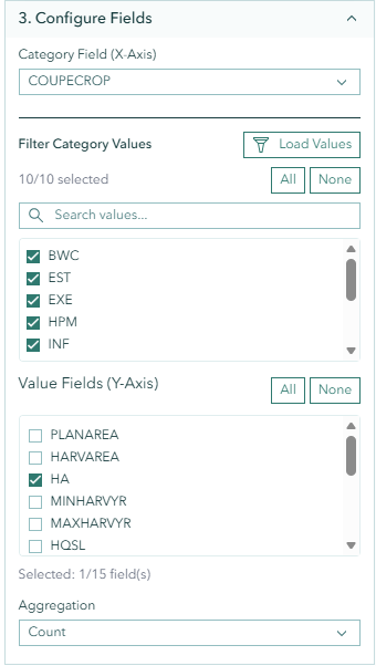
Category Field (X-Axis)
Select a text or categorical field from the Category Field dropdown. This field defines how data is grouped along the chart's X-axis.
Value Fields (Y-Axis)
Select one or more numeric fields from the Value Fields list:
- Use checkboxes to select individual fields
- Click All to select all numeric fields
- Click None to clear the selection
- The count of selected fields is displayed (e.g., "Selected: 1/15 field(s)")
Special cases:
- Heat Charts require a second category field for the Y-axis grouping
- Scatter Charts require exactly 2 numeric fields for X and Y axes
Aggregation Type
Choose how numeric values are aggregated:
- Count — Number of features in each category
- Sum — Total of all values
- Average — Mean value
- Min — Minimum value
- Max — Maximum value
Step 4: Generate the Chart
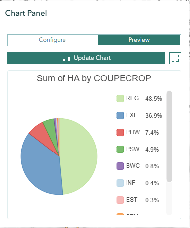
Click the Create Chart button to generate the visualisation. The panel switches to the Preview tab showing your interactive chart.
Optional: Filter by Category Values
- Click Load Values next to the category field to retrieve unique values
- Use the search box to filter the value list
- Select or deselect specific values using checkboxes
- Click All or None for quick selection
- Click Update Chart to apply the filter
Fullscreen Mode

Click the Fullscreen button in the chart preview to open an expanded view. The fullscreen modal includes a sidebar for adjusting configuration without closing the view.
Chart Types
Bar Chart
Displays rectangular bars proportional to the values they represent. Ideal for comparing values across categories such as tree species counts by region.
Line Chart
Connects data points with lines to show trends. Useful for visualising changes across ordered categories or sequential data.
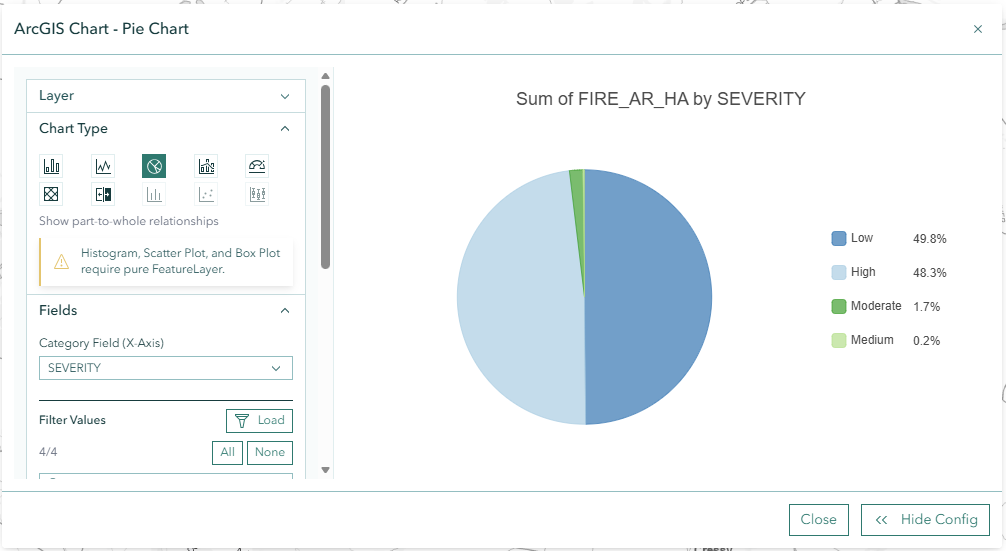
Pie Chart
Shows proportions of a whole as slices. Best for displaying percentage distributions such as land use types within an area.
Heat Chart
Creates a colour-coded grid using two category fields. Requires both a primary category (X-axis) and a secondary category (Y-axis) to produce a cross-tabulation matrix.
Histogram
Displays the frequency distribution of a single numeric field. Shows how many features fall into each value range. Available only for native Feature Layers.
Scatter Chart
Plots individual features as points using two numeric fields for X and Y coordinates. Reveals correlations and clustering patterns. Available only for native Feature Layers.
Box Plot
Displays statistical distribution summaries (median, quartiles, outliers) for numeric data across categories. Available only for native Feature Layers.
Troubleshooting
| Issue | Solution |
|---|---|
| No layers in dropdown | Ensure at least one feature layer is visible on the map |
| Chart type buttons disabled | Some types require native Feature Layers, not Map Image Layers |
| No numeric fields available | Ensure the selected layer has numeric attribute fields |
| Chart is blank or empty | Check that category and value fields are correctly selected |
| "Load Values" returns nothing | Verify the selected category field contains data |
| Chart generation fails | Try selecting a different layer or reducing the data scope |
Frequently Asked Questions
Q: Can I chart data from Map Image Layers? A: Yes, the tool automatically converts Map Image Layers to Feature Layers. However, advanced chart types (Histogram, Scatter, Box Plot) are only available for native Feature Layers.
Q: Can I view multiple numeric fields at once? A: Yes, select multiple value fields and use the tabs in the chart preview to switch between each field's visualisation.
Q: Does filtering affect the original layer? A: No. The chart tool applies temporary filters for the chart only. Your layer's definition expression is preserved and restored after charting.
Q: Can I export or save charts? A: Currently, charts are displayed within the panel. Use your browser's screenshot functionality or the Print tool to capture chart visuals.